Picking the Right Paint Colors for your Airbnb
Apr 19, 2024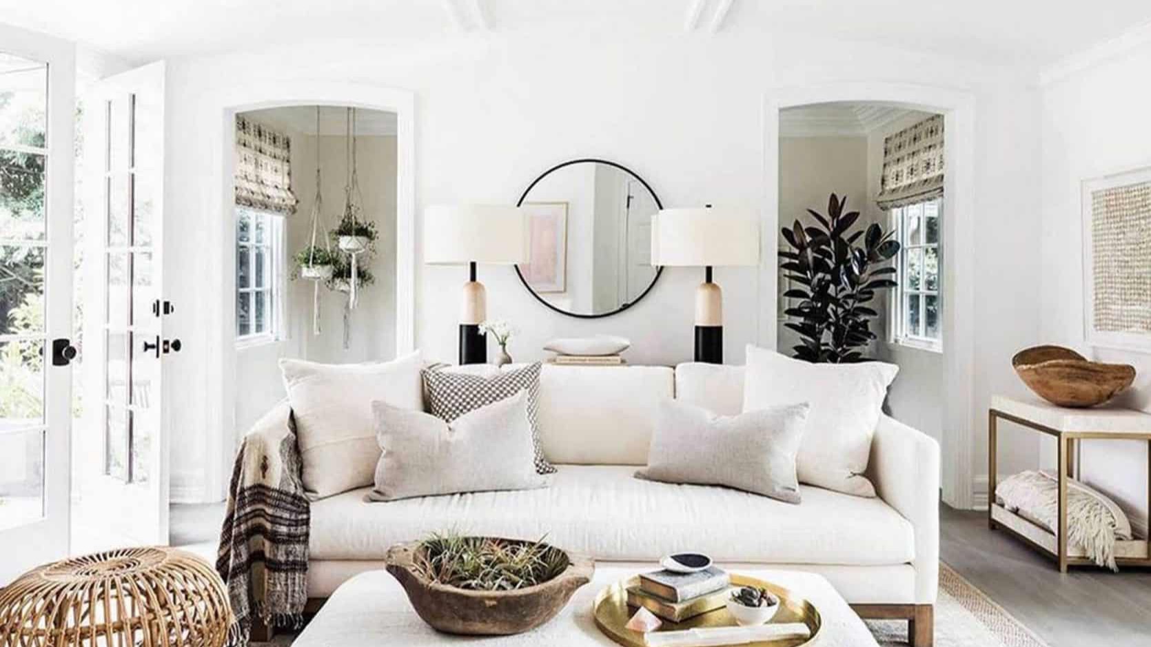
Painting is expensive, especially when you're having someone else do the work. Chances are you're outsourcing the labor in your short-term rental property so this is an investment that you want to get right.
Don't worry, superstar Airbnb host, you're in the right place!
Start with a tight color palette
The first step in picking the right paint colors is to think about all of the colors you want to use in your space — furniture, throws, artwork... everything! Your walls and woodwork are only part of the picture here! In an Airbnb, the best thing to do is to start with a tight color palette with a small number of colors.
Why? Because it will make the design of your spaces look less chaotic and more intentional. The brain feels calmer when things around a room relate to one another because there is less to process.
Here are 3 go-to rules for planning a color palette:
1. Follow the 60/30/10 Rule
This rule says you use light-colored neutrals for 60% of your space, the next 30% are for deeper-toned neutrals, and the last 10% are your pops of color.
Under this rule, you would leave your walls pretty light in color throughout, except for maybe an accent wall somewhere. I say you can't go wrong with light bright walls for a short-term rental or Airbnb property.

This gives you a gorgeous blank canvas and sets the stage for decorating success. Light, bright walls also immediately make your space more photogenic, and this is MEGA IMPORTANT. Your photos are a huge part of what gets you bookings and thus more income.
(Keep reading...we'll get to actual paint colors, I promise!)
2. Keep the Palette Consistent
Reuse the same colors, including accent colors, around the entire home for simplicity. Or change it up by room if you want, but think through complementary colors and keep things simple.
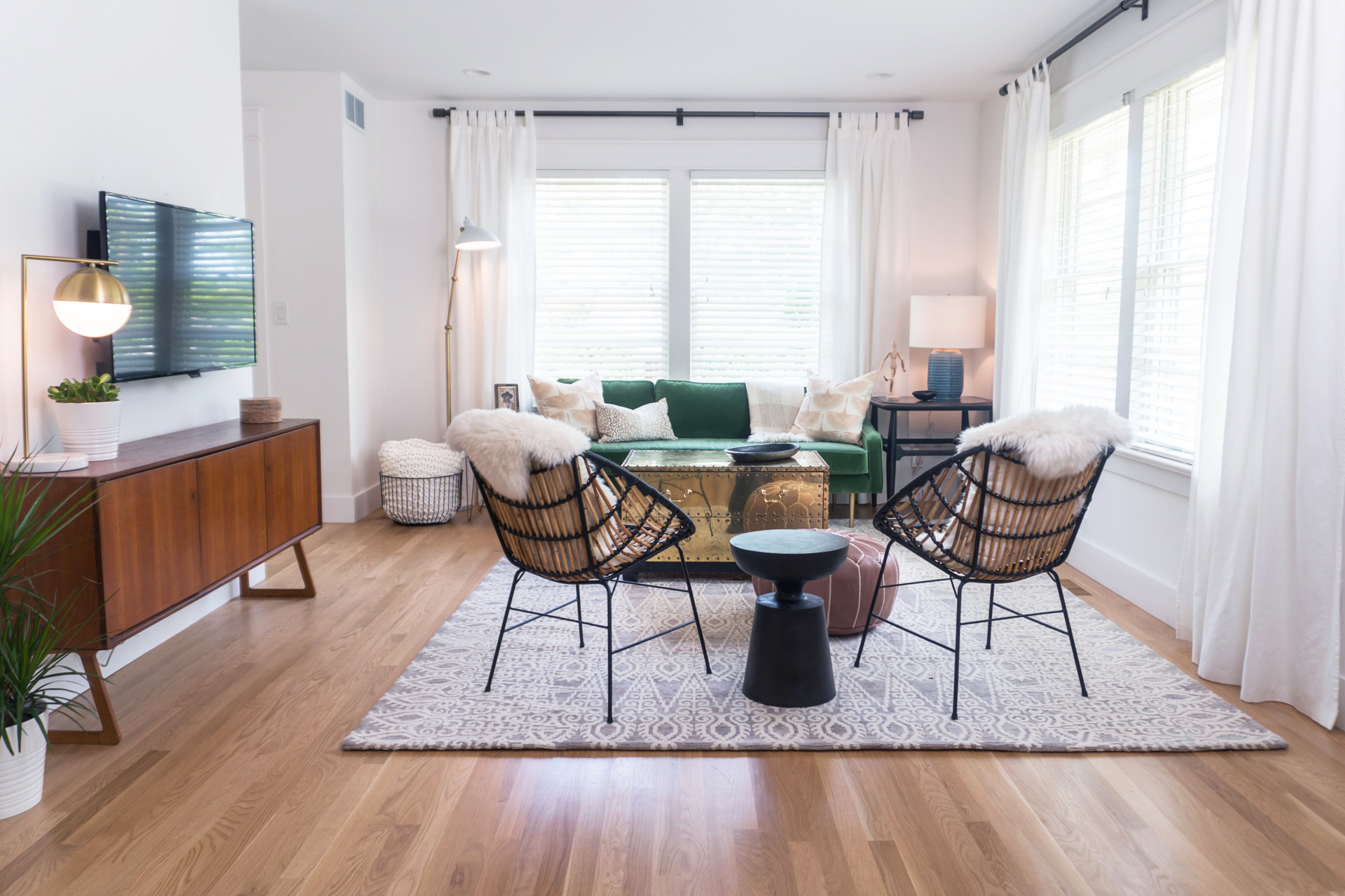
In this Airbnb, the color palette was 60% white and light neutrals (walls, curtains, some accent pillows, lamp shades, rug), 30% richer neutrals (wood floors, wood sideboard, gold coffee table, bamboo accent chairs, ottoman and I'd put the black accents into this category- curtain rods, some pillows, basket, accent tables), and 10% pops of color (Green sofa, blue lamp, pink bird pillow, and live greenery aka plants - for those of you without a single green finger, check this out for plants you won't kill within a week!)
Part of the reason the lively green sofa works so well in this room is because we pushed it to the front and center of the stage, so to speak. The rest of the room is set up to allow this piece to stand out and shine. And then we dotted some more green around the room strategically so it didn't feel all alone in the spotlight.
3. My favorite color rule: All shades of one color MATCH

image above: Designer Leslie Shewring via decor8 blog
If you want to go green on green on green, go for it! This is called monochromatic (Yep! Monochrome isn't just black and white!) and it works every time.
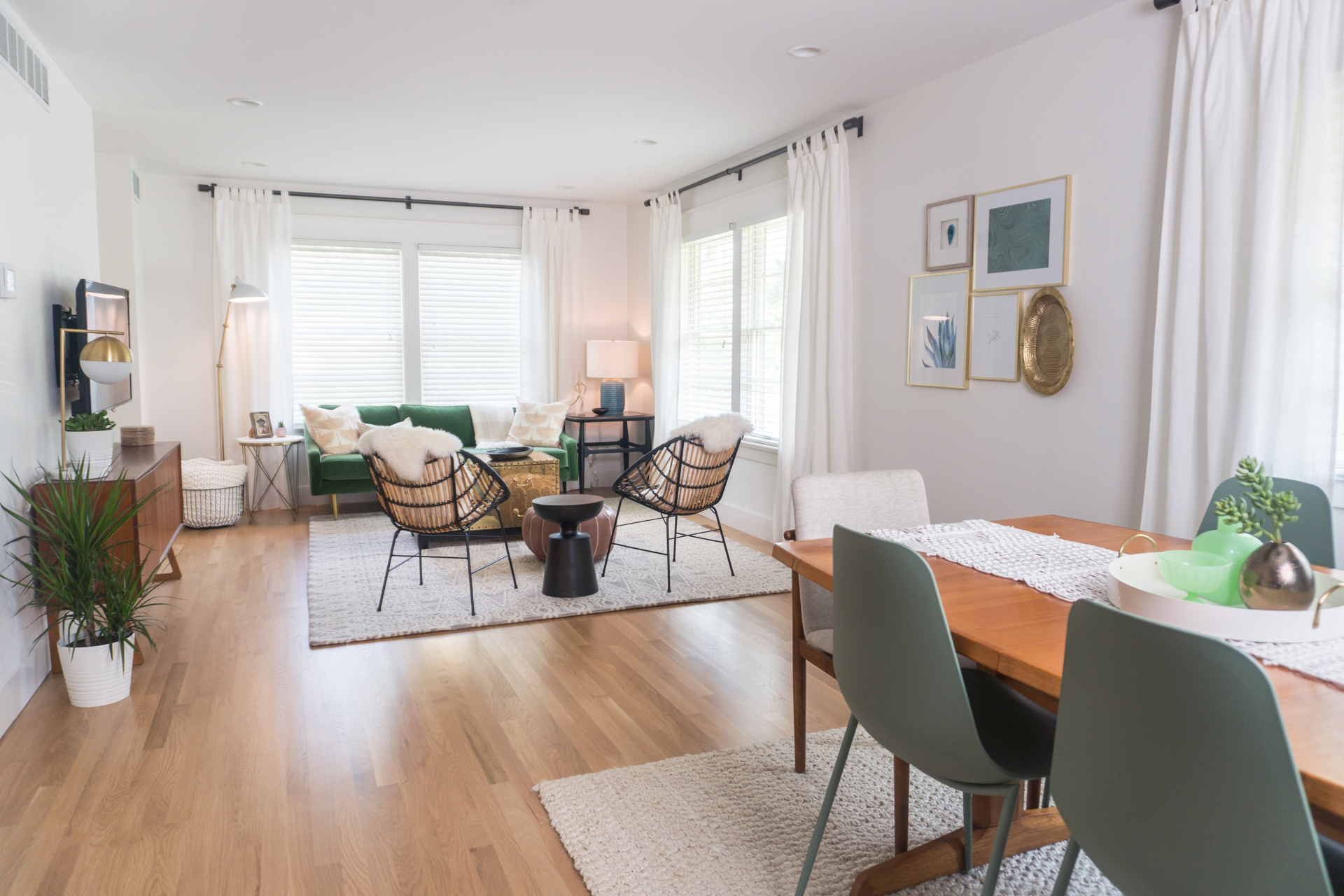
The silver-green of these dining chairs is quite different than the kelly green velvet fabric on the sofa, but they work beautifully together in this space. The crisp white walls were no accident, and allow these two greens to stand out as the stars in this open-concept living space. The blue and green art in the wall collage pulls the color scheme together and connects the two spaces further.

Ideas for where to put the 10% color pops
First the 60%... What's most important about the 60/30/10 rule is that you make the largest part of your space (the 60%) a lovely, clean, neutral backdrop. If you're feeling overwhelmed with the design process, this is the easiest way to simplify but still end up with a space that's beautiful and photographs well.
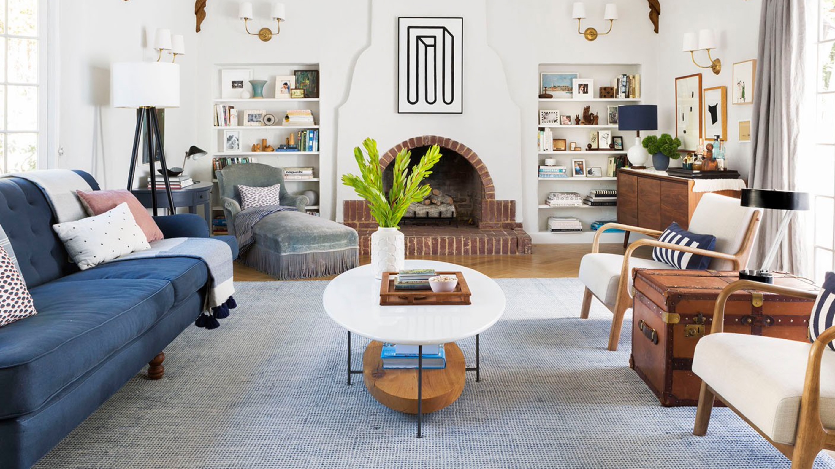
The 30% you may find easy because most spaces tend to already have some kind of rich wood tones going on. It is important to think about the various wood tones you'll have in one area. How do they relate? Can you ensure some of your wood tones will be a close "match" or even the same wood and stain? (If so, bonus designer points!)
 image above: Design by Andrew Kotchen & Matthew Berman // Photography Donna Dotan via Elle Decor
And for those all important 10% pops of color? Art and accents are an excellent choice! Throw pillows, art, lamps, planters and ottomans are easy to change out and replace if you want to change up your color palette down the road. Also, you can't go wrong with a punchy-colored dining chair, as you can see in this beautifully done coastal-style dining space.
 image above: Design by Andrew Kotchen & Matthew Berman // Photography Donna Dotan via Elle Decor
Below, this bold bookcase painted a bright, cheerful blue stands out as the perfect focal point in the room, and everything else plays supporting roles to this shining star. The wallpaper in the background has a subtle amount of the same tone of blue to tie things together, without overwhelming the space.
 image above: Design by Christine Turknett via The Effortless Chic
Maybe you're not quite ready to commit to painting furniture a bold hue... If so, then books are a great place to add pops of color. If you have a library for your short-term rental, then organizing the books by color is a great way to make a space feel pulled together and intentional.

image above: The Little Market
If you have some empty shelves that you need to fill with interesting vintage books, check out these Etsy shops. A lot of shops will sell you cool books in one color wash so that they will fit right into your color palette beautifully, and you don't have to go digging around the flea market yourself. (Although that can be really fun, too!)
Plants are a Color Right?
 image above: The Farmhouse Oasis
Ummm, yeah! If you want to sweep the color slate clean and add all your pops in plants, that's cool! And done a lot these days like in the gorgeous Cali Airbnb above.
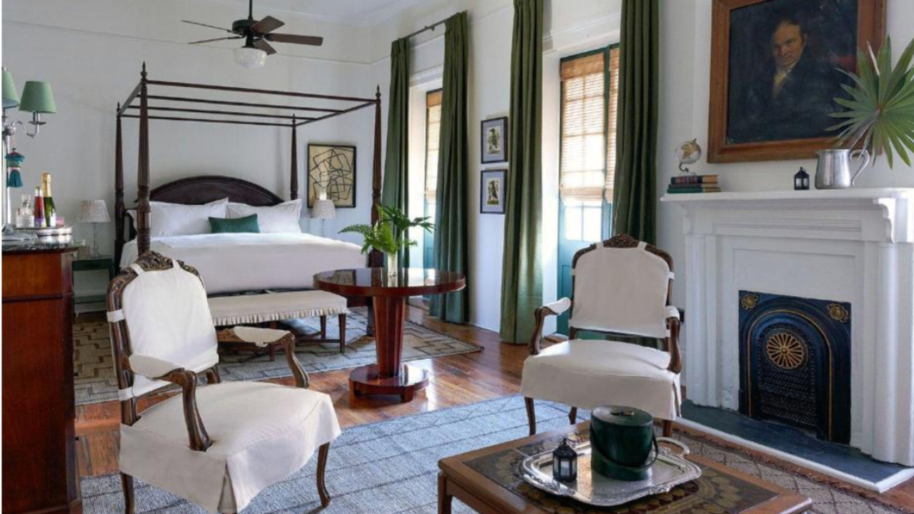
What to paint the walls
Okay, so now that we've got a solid foundation around the color palette and color theory for your space, let's talk about why you came to this blog in the first place... PAINT COLORS!
As I've preached above, neutral colors are the way to go for your short-term rental walls. Here are my favorite whites and neutrals that have never let me down.
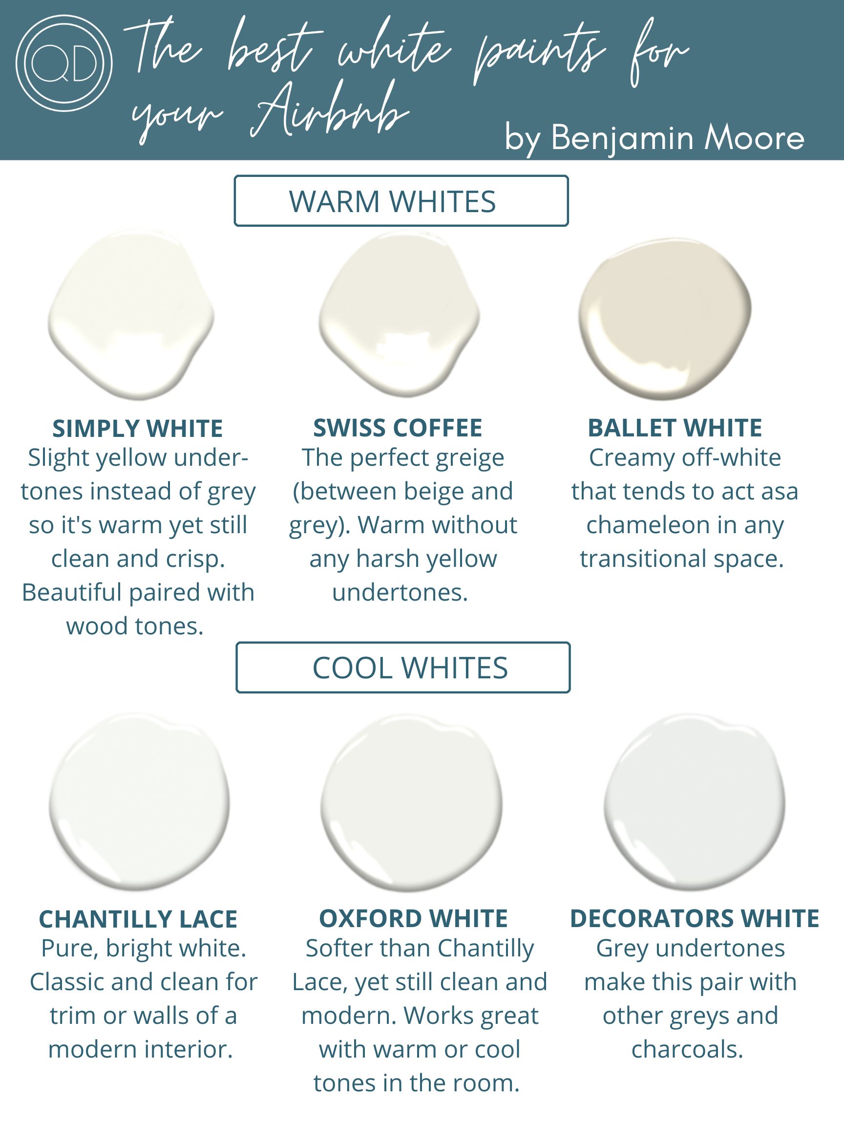
All paint above by Benjamin Moore
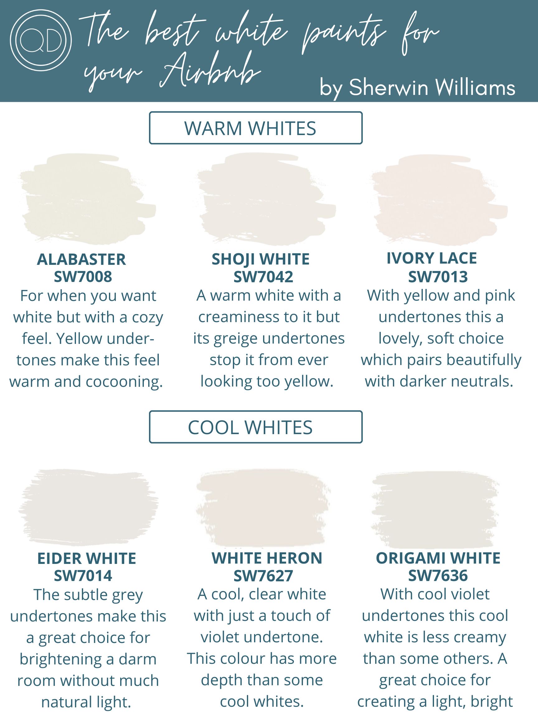
All paint above by Sherwin Williams
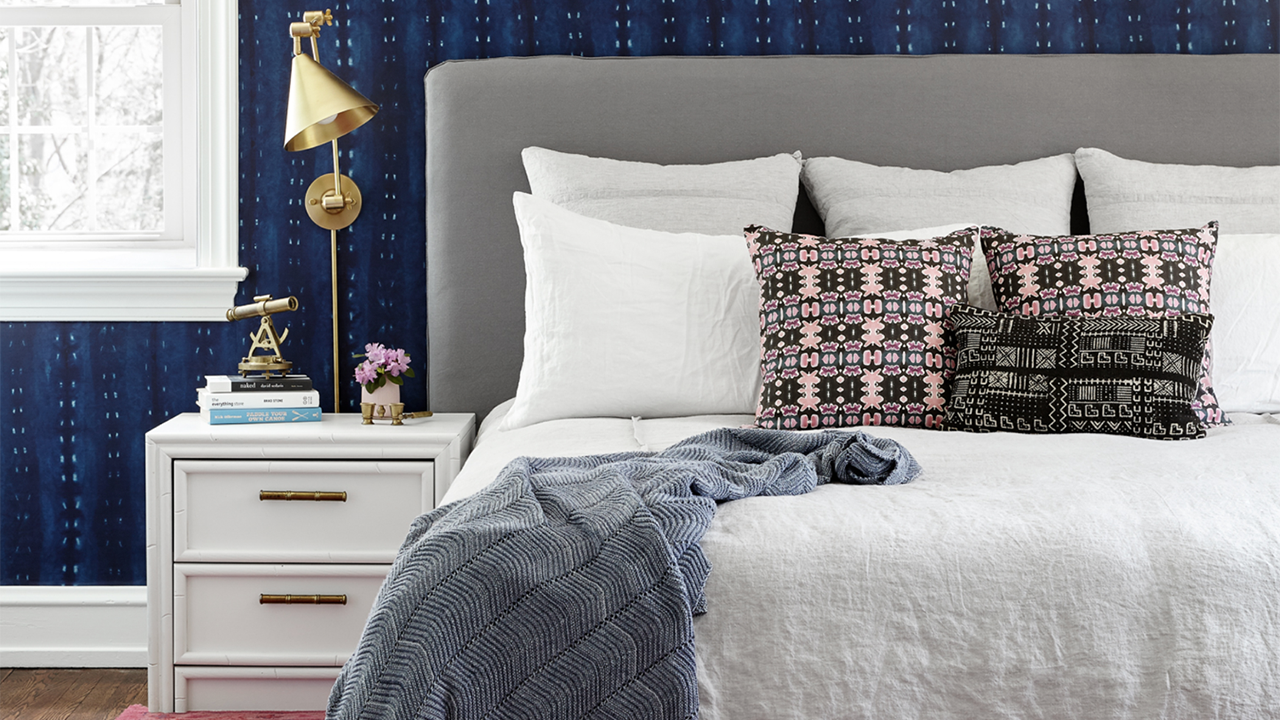
When to add Accent Walls
If you're itching to add an accent wall for one of your pops of color, here are some guidelines around where and how to achieve this.
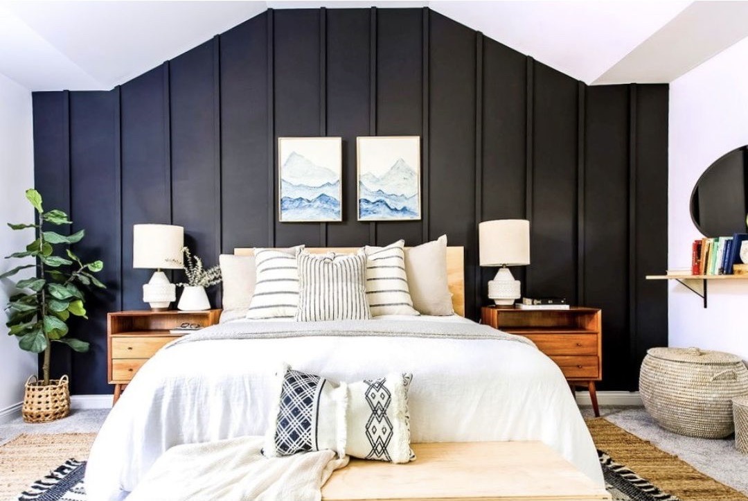
image above: Anna Mae Groves
- A wall that is a natural focal point is a good choice for an accent wall. So this would be a headboard wall in a bedroom, a prominent art wall in a dining area, or the wall above your sofa if it's just a big blank stretch of boring drywall. This may help that wall stand out as special in your space, and draw the eye into that area.
- As for what color to choose, head to Pinterest for some inspiration, but remember to pull directly from your color palette to keep things consistent and related within your property.
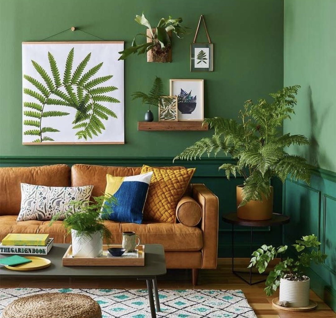
image above: Carson Downing
When to add Wall Paper
Wallpaper can be expensive, but also extremely impactful! If you're considering wallpaper for your short-term rental, here is my advice.
 image above: The Glitter Guide
- Make sure the area you're planning your wallpaper for is prominent and highly visible. Done right, this investment is going to make your home stand OUT in your photos, which is everything for getting more bookings.
- If you're a DIY kinda guy or gal, you can choose to hang an adhesive-backed wallpaper, like one of these from Society 6. This is a great company based out of Nashville, TN.
- If you're planning on papering a smaller room, like a bathroom or bedroom, it's best to paper the entire room, or the upper part of the walls if you have wainscoting at the bottom. If you're considering wallpaper in a larger area, then just one accent wall can be great.
And before you decide on whether or not to wallpaper, it's definitely worth checking out this recent blog for more of my wallpapering tips, tricks and best buys!
Best of luck with your color palette and paint selections! When in doubt, pick one of those whites listed above, and layer in your color and depth in other areas.
XOXO